In her Masterclass on interior design, Kelly Wearstler talks about the “vibe tray” that she curates in the preliminary stages of designing a space. She pulls together samples and objects that begin to tell a story about the space. I’m incorporating this practice into my own creative journey—consider this my visual “vibe tray.”

1. Jill shared this on our team Slack, and I immediately downloaded the image. What I love about it: the typography, the white space, the streaks of pastel that remind me of Zebra mildliners.

2. That one time we stayed at the Proper Hotel Santa Monica and my outfits matched the actual wardrobe. I’m inspired by the color palette of salmon, terracotta, and goldenrod with pops of glossy white and creamy lace and want to renovate our master bedroom closet using the same paint color.
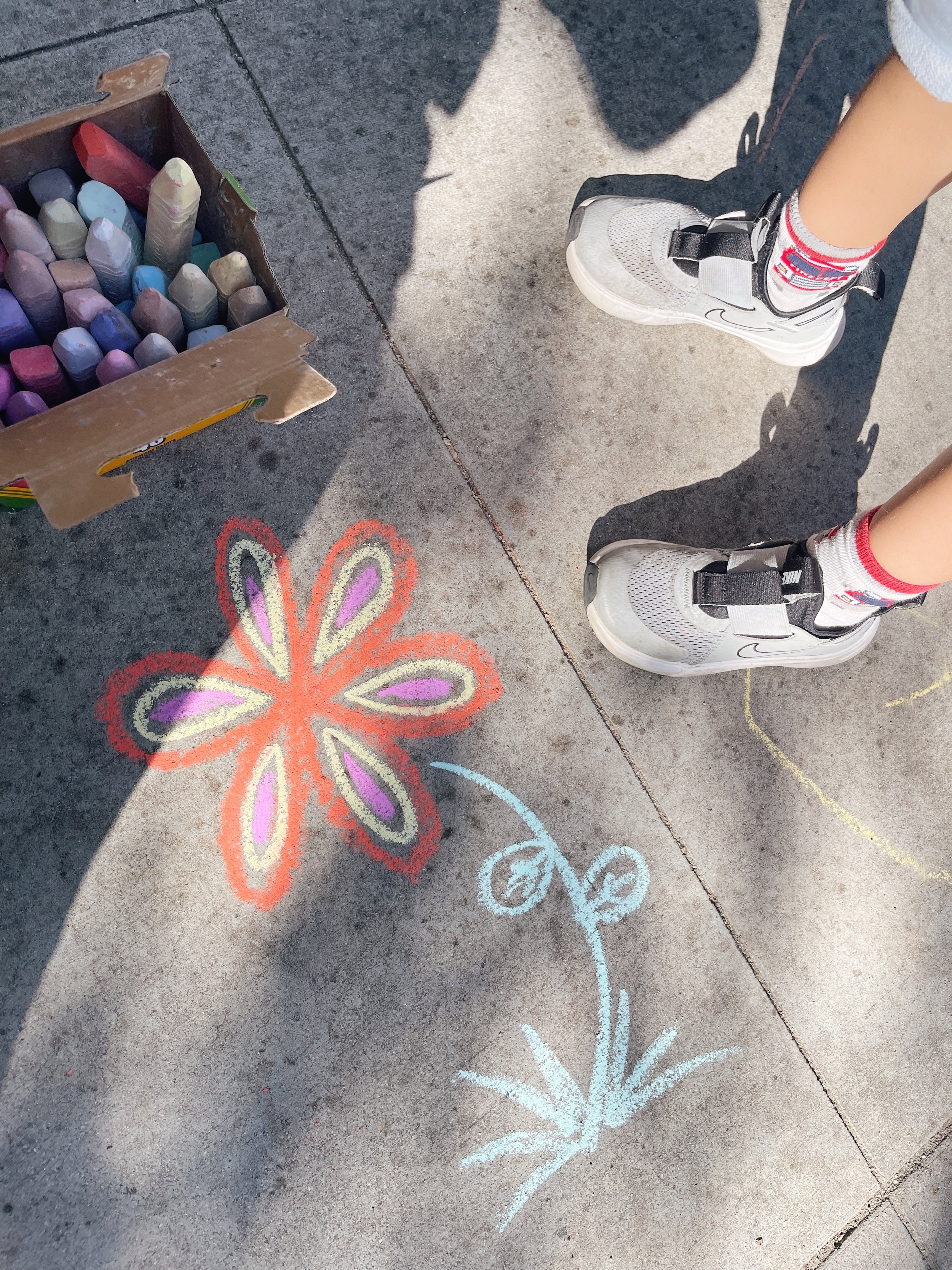
3. Another mom drew this flower in chalk at our neighborhood park, and I couldn’t help but snap a pic because the colors felt so vibrant and fun. I loved the colors so much that I purchased this set of notebooks in a similar color palette specifically for my morning pages. Day one of morning pages complete, and I already have a new idea for the MOPS talk I’m giving. I thought about picking up a cheap (under $1) notebook from Target, but in the end, I’m glad I went with these ones—a little bit of pretty goes a long way to inspiring creativity.

4. These Whitney English day planner tabs capture pretty much all of my favorite colors: lagoon blue, seaside turquoise, citron, rose pink. I’m taking cues from the Nov-Dec-Jan tabs for the foundation of our master bedroom redesign, and the May-Jun tabs are giving me all the Valentine’s/galentine’s decor vibes.

5. I’m trying to pay closer attention to the natural beauty around me: the smell of the forest, salty ocean air, and shades of green—balsam, jade, moss, emerald.
What’s setting the tone for your creative projects?